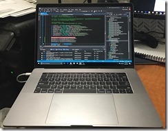
Developer First Impressions of the 2016 MacBook Pro
I haven’t been an “Apple” person for long, but since I bought my first MacBook Pro in early 2013 I was really impressed with the quality of the hardware, the feel of the device, how small and lightweight it was was light-years ahead of any other laptop I could buy at the time. The MBP turned into my travel laptop of choice, I had 2 Windows laptops (1 from Dell the other from Asus) that I just stopped using and gave away. A .Net Developer only traveling with a Mac, that was crazy talk.
 Fast forward, 3 freaking years without a meaningful hardware upgrade, and were now in 2016 and a new MacBook Pro has been announced. It’s a significant hardware upgrade over my 3 1/2 year old MBP, but not so much if you have a kitted out version of the last revision.
As I started to write this I’ve been using it off and on for a couple of days into my 10 day stress test, so not really stressing it yet. But I’ve already noticed a few things.
- Build Quality Is Amazing, as usual: When your paying top dollar for a laptop we expect it’s going to feel good. The system is solidly built, it it’s noticeably smaller and lighter then my 3 year old MBP, but has a solid heft to it. Opening and closing the screen is fluid and sturdy.
- Hardware Spec’s are “Meh”: I went for the upgraded processor and video card. For me when I travel I like the ability to play games. I only went with the 512GB SSD, as the 1TB model was an extra $400 bucks and I could not justify that, I’ll just carry around some 128GB Thumb Drives, not that big of a deal. But power wise the Surface Book seems to have the edge in terms of raw horse power.
- Ports aren’t “Portie”: Apple FINALLY went with standard ports, but unfortunately they picked ports that almost no one else uses. This means I had to replace my almost $200 bucks worth of adaptors for my old MBP. I was also a fan of the MagSafe charger, kinda sad to see that go.
- Screen: The new MBP’s screen is really nice, very crisp and bright, color seem good and vibrant.
- Trackpad: I am not a fan of the larger trackpad that takes up the entire middle of the front of the laptop. I don’t mind the loss of the mechanical press on the trackpad and instead going haptic, it still feels ok, not great. But the damn size, with my larger hands my palms routinely pour over the pad and that sometimes causes issues. Minus some ghost mouse movements, and clicks, it’s uncomfortable, there’s a lip around the pad and you can feel that on your palm.
- Touch Bar: Every review out there is glowing about the touch bar, but for a developer, this downright sucks. The touch bar is an OLED screen, and inset into laptop below the levels of the keys in the keyboard. When typing there is no way to correctly position your fingers to ‘feel’ if your pressing the right OLED button. To me this Touch Bar is a gimmick and a step backwards for any keyboard warriors.
- Keyboard: This is my biggest gripe with the new MBP. They keys are the new ‘butterfly’ design and have almost no key travel. There is a satisfying ‘click’ when typing but almost no physical feedback of a keypress. The keyboard layout changes also are not good, the arrow keys particularly are completely messed up, I guess they didn’t like the space above and below the left and right arrow key? Like serious WTF.
I’ve never before considered returning an Apple product, but after a day of use I looked up their return policies. Including taxes I spent $3,300 on the laptop and tack on another $400 for Apple Care. I still don’t know if I’m going to keep the new MBP, I’m seriously considering a Surface Book or Razor Blade as alternatives and keeping my old MBP for XCode builds.
If you’re a First Responder or know one check out Resgrid which is a SaaS product utilizing Microsoft Azure, providing logistics, management and communication tools to first responder organizations like volunteer fire departments, career fire departments, EMS, search and rescue, CERT, public safety, disaster relief organizations.