Bad User Experiences and the Listerine Cap
Over the years I’ve gained more and more respect to the men and women who design our User Experiences. UX isn’t just for software, but everything you interact with, your keyboard, TV, fridge, the gear selection on your vehicle, all of those are UX interactions.
These interactions are vital to our use of a product, in extreme cases bad UX design can even cost lives. Your own unique products UX also trains the users the nuances of your product over time. Where you place buttons or interaction elements, the colors you use or even the textures.
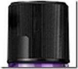
Which brings me to a major UX failure that’s annoyed me to no end, the new Listerine Cap. Previous versions of that cap looked like this:
The smooth section is where you place your fingers to squeeze the cap to release the child proof lock. Over years of using the product instinctively I knew what to do, so much so I could open the cap easily in the dark. Hopefully whoever designed this cap got a nice bonus.
Recently I bought some Listerine again and noticed immediately I was actually having difficulty opening the cap. I figured I was tried, distracted or whatever and moved on. But day after day I had the same trouble getting the cap off. It got to the point where after a long day driving a Water Tender around a Wildland fire I just hulked the cap off in a fit of rage. The issue, the cap design.
The bottom section, where they put the logo, classy BTW, is smooth all the way around. From touch it’s almost impossible using coarse motor skills to identify, without looking, where you need to squeeze to open up the cap. Hopefully whoever designed this cap, most likely someone from marketing, gets a swift kick in the genital.
This small change has actually soured my opinion of the product, so much so that at least in the near future I won’t be buying it again. But it’s a powerful reinforcement, if something so minor can turn me off of a very cheap product, how many minor UX issues in my products have turned people off from buy decisions?

